ReBranding AI Generated Logos
Project Overview
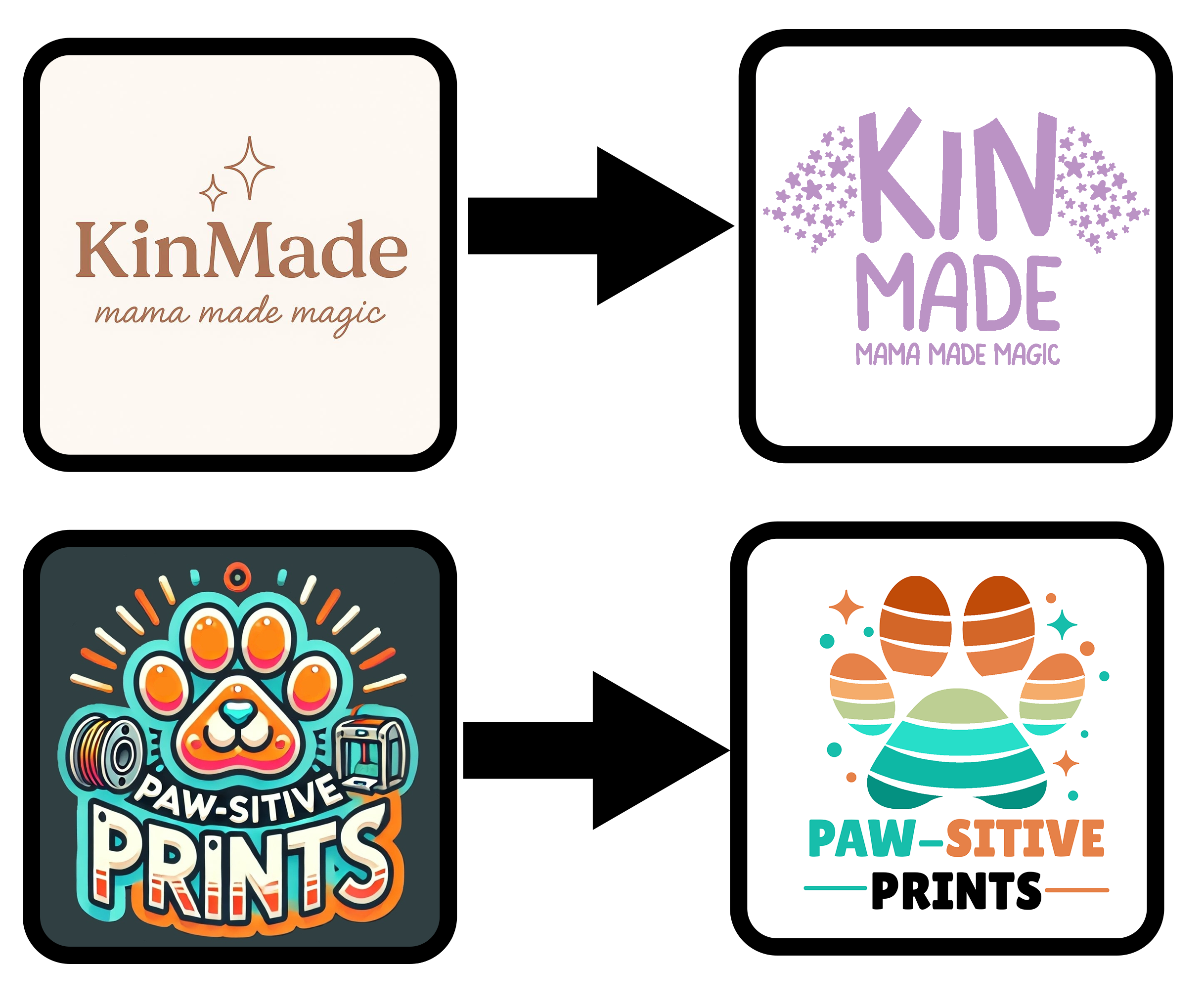
The Goal: I wanted to prove that a designer's eye is better than an algorithm. AI logos often look "nice" at first glance, but they are usually cluttered, hard to read, and lack a real connection to the industry they represent. I took two AI concepts and rebuilt them from scratch to give them personality, scalability, and a clear identity.
01. KinMade: From "Bland Boutique" to "Magical Maker"
The Problem: The old AI logo felt like a generic corporate template. It was a bit "cold" and didn't really say anything about kids or creativity.
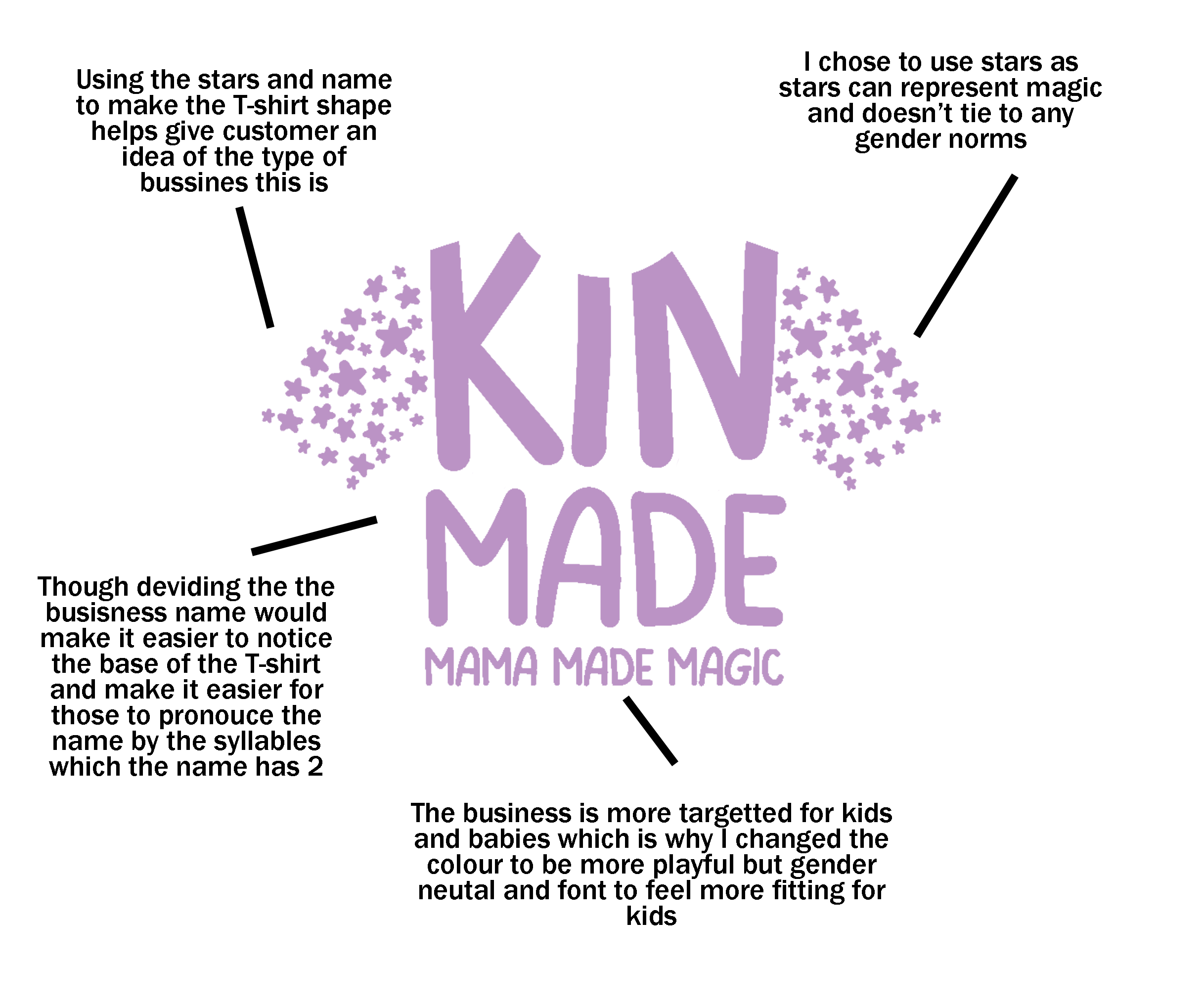
The Fix: I wanted a whimsical, magical vibe. * The Identity: I chose a "Magical Purple" that works for everyone (gender-neutral) and switched to a chunky, friendly font that feels safe and fun.
- The Clever: I stacked the name "Kin-Made" to help with pronunciation and arranged the star clusters to subtly hint at a T-shirt shape. It's not just a logo anymore; it's a story about making magic.
02. Paw-sitive Prints: From "Messy Sticker" to "Pro 3D Maker"
The Problem: The AI original was a mess. It had too much detail (the realistic 3D printer) and "wobbly" shapes that would look terrible if you printed them small. It felt like a clip-art sticker, not a business.
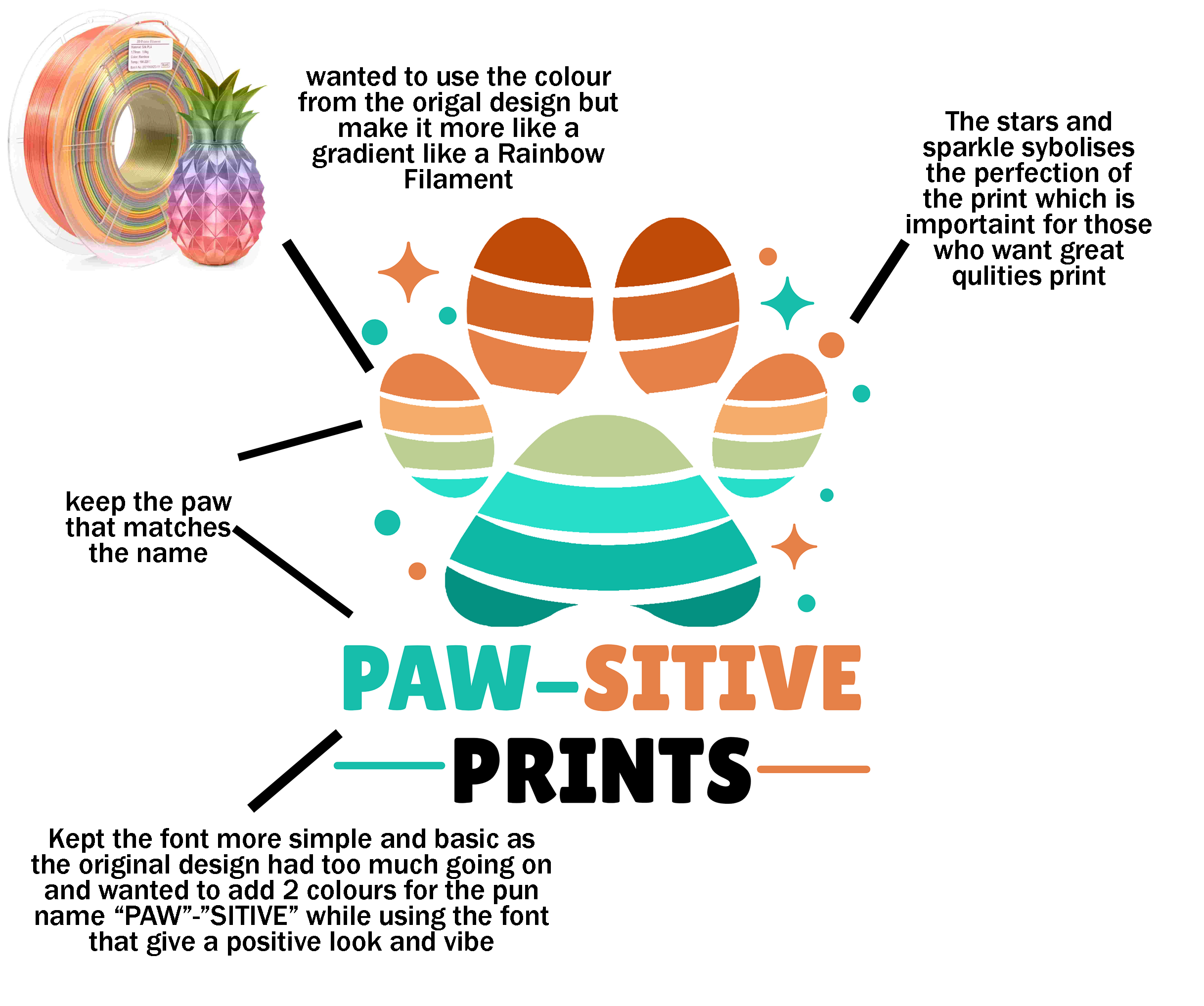
The Fix: I stripped it down to a clean, professional flat design.
- The Vibe: I used a "Rainbow Filament" color palette. If you're into 3D printing, you recognize those colors immediately. It gives the brand instant authenticity.
- The Identity: The layered paw print represents the "slices" of a 3D print. It's simple, bold, and tells you exactly what the business does without being cluttered.
Summary: AI is a starting point, but the originality comes from the human choices-the colors that mean something, the hidden shapes, and the font that actually fits the vibe.
Gallery
Back to portfolio
All Projects