Ember Oaks: Artisan Coffee Brand Identity
Project Overview
Ember Oaks is a fictional artisan coffee brand created as a branding project to explore how a visual identity can communicate warmth, nature, and craftsmanship. The aim was to create a brand that feels welcoming and premium while still keeping a strong connection to organic and sustainable values.
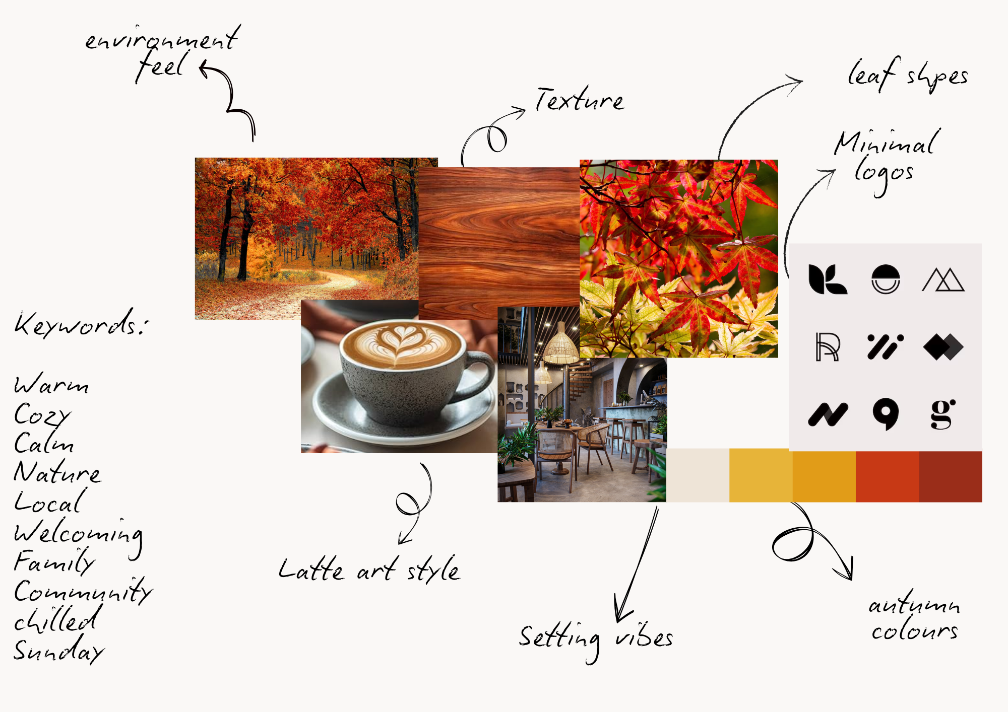
The inspiration behind Ember Oaks came from combining two key ideas: the warmth and comfort associated with coffee, represented through the "ember" element, and the natural growth and stability represented by the oak tree. I wanted the identity to feel like a place where people could slow down, connect, and enjoy a handcrafted experience.
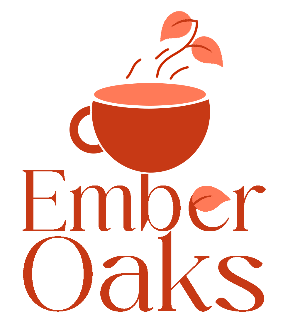
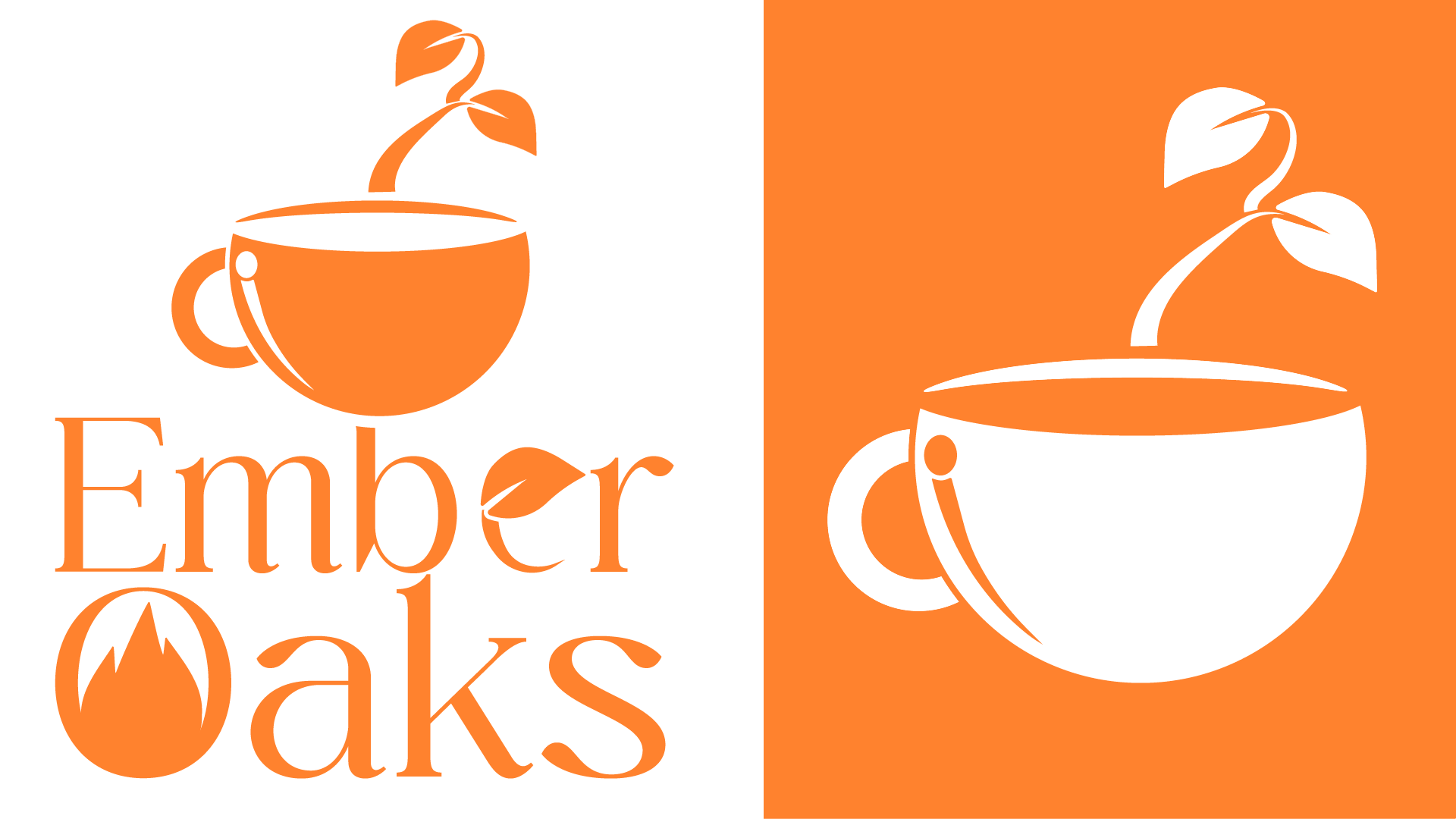
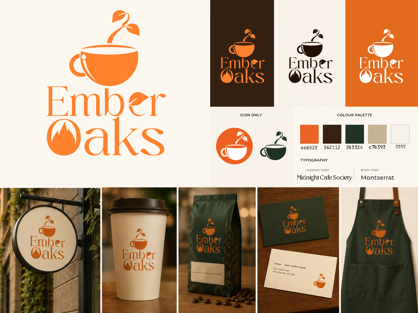
The logo combines a coffee cup with a growing oak sprout to represent the relationship between coffee and nature. The rising steam transforms into a small plant, symbolising growth, freshness, and the journey from natural ingredients to the final cup. I chose a warm orange colour palette inspired by glowing embers and roasted coffee tones, creating a feeling of comfort and energy.
For the typography, I selected an elegant serif style to give the brand a handcrafted and premium feel while keeping it approachable. The custom leaf detail integrated into the lettering helps connect the wordmark back to the natural theme and adds a unique brand element.
Throughout the project, I developed the full visual identity from initial research and moodboards through to sketches, digital logo development, colour exploration, and branded mockups. The final designs were created to show how the identity could be applied across different touchpoints, including packaging, signage, and digital platforms.
Gallery
Back to portfolio
All Projects